Analyzing ipv4 trades with gnuplot.
Table of Contents
- 1. TODO Remaining tasks
[0/2] - 2. Real-time analysis
- 3. Analysis from 2024-07
- 3.1. Single Price from time
- 3.2. Price inconsistency
- 3.3. Single Price smoothed
- 3.4. Average Single Price Summing by time
- 3.5. Price distribution
- 3.6. Batch size distribution
- 3.7. How batch size changes with time
- 3.8. Market Volume by time
- 3.9. Let us see how many batches are expensive.
- 3.10. Finding an actual average price per month
- 3.11. Processed data
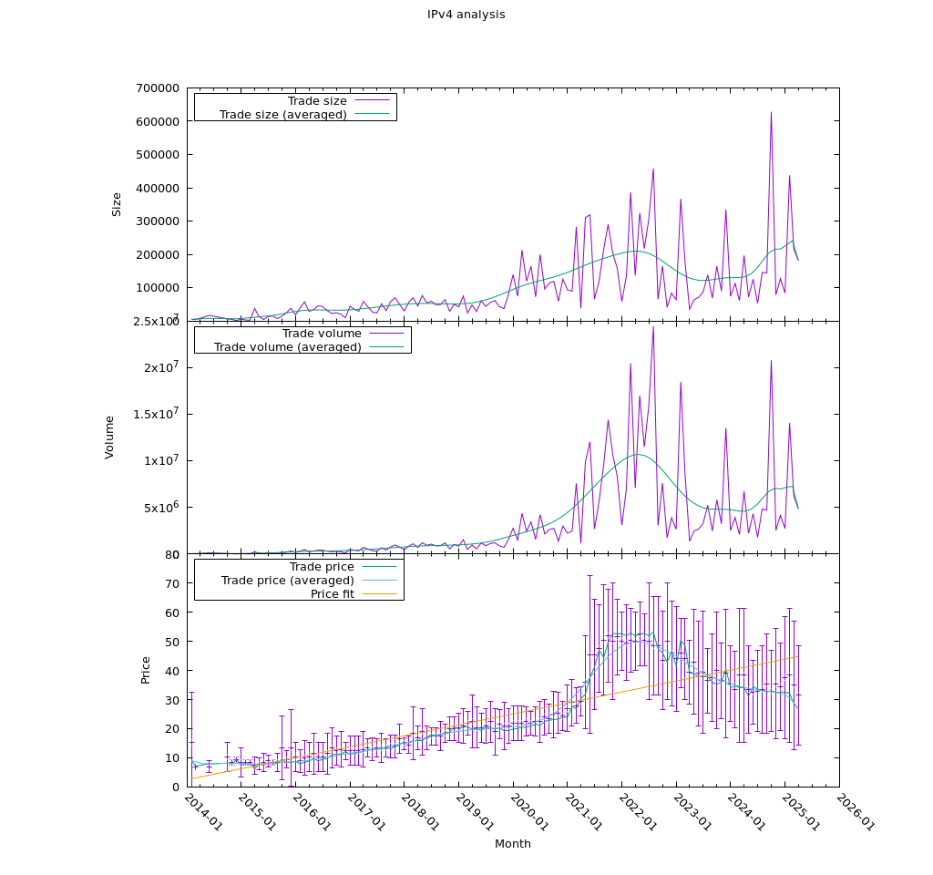
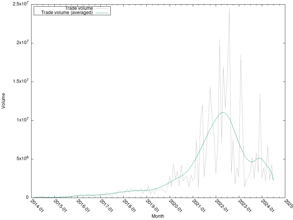
- 3.12. Trade volume
This demo is created with two purposes in mind:
- Show some features of gnuplot.
- Analyse and predict the behaviour of supply and demand of ipv4 addresses as the Internet transitions to ipv6.
The data in this demo is taken from the ipv4.global auction.
The data file looks the following:
Date, nIPs, TotalPrice, OnePrice
2014-02-06T11:00:00, 512, 8025, 15
2014-02-26T11:00:00, 256, 6225, 24
2014-02-26T11:00:00, 4096, 29983, 7
2014-03-25T11:00:00, 4096, 29684, 7
2014-06-18T10:00:00, 16384, 131072, 8
2014-06-19T10:00:00, 256, 1725, 6
1. TODO Remaining tasks [0/2]
[ ]SVG to all plots. (?)[ ]Predictions
2. Real-time analysis
2.1. Fetch in an org script.
Number of ids: 5206
Number of dates: 5206
Number of dates: 5206
Number of nIPs: 5206
Number of prices: 5206
Number of IPprices: 5206
DONE
Last bids:
2026-03-05T20:03:45, 65536, 655360, 10
2026-03-05T22:48:30, 256, 7680, 30
2026-03-06T00:56:38, 65536, 688128, 10
2026-03-06T06:37:51, 2048, 36352, 17
2026-03-06T08:22:50, 65536, 819200, 12
2026-03-06T14:48:32, 1024, 26624, 26
2026-03-06T17:09:37, 65536, 707788.8, 10
2026-03-06T17:12:19, 8192, 114688, 14
2026-03-06T17:13:10, 8192, 114688, 14
2026-03-06T17:13:48, 2048, 32768, 16
2.2. Plot price, size, and volume
3. Analysis from 2024-07
3.1. Single Price from time
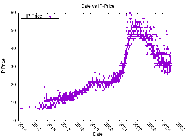
Let us first plot the price of the IPs from time:
3.2. Price inconsistency
Well, those prices are a bit off, because they are not weighted by volume. That is, even though the prices are correct, some of the IPs were sold in larger quantities, so the price per day should really be a weighted average.
We should take this into account when reading on.
What we need to do is to create daily prices, or maybe even weekly, because we need a trend, not immediate volatility. But this is later.
This will be solved later.
3.3. Single Price smoothed
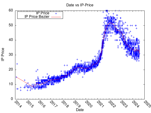
Let us try to smooth the price in different ways.
3.4. Average Single Price Summing by time
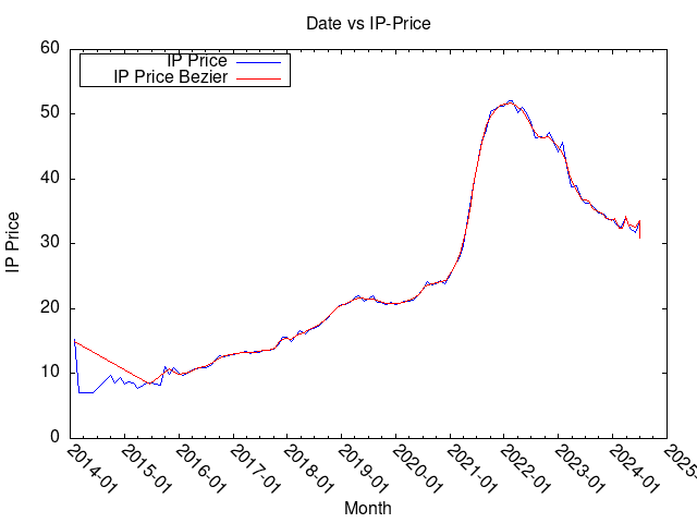
Here I am doing two tricks: abusing time format for plotting by month, not minute, and using smooth unique to find an average of those prices.
This should really be done in a script, and fed to gnuplot separately, but so far I have not explored gnuplot sufficiently.
Interestingly (and expectedly), the bezier interpolation is matching the improvised one very well, except the very beginning.
3.5. Price distribution
The price depends on time (and, I guess, supply and demand), but suppose you just had to buy some IP addresses between 2014 and 2025. What was the chance that you would buy it cheaply or expensively?
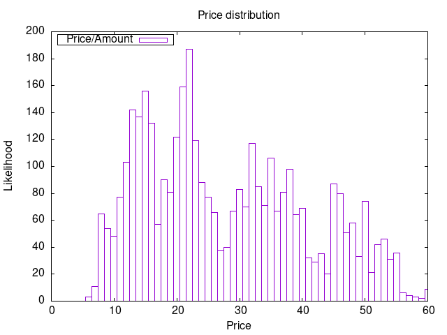
Four (but really three) modal distribution. Most orders seem to be made around the 20 USD threshold.
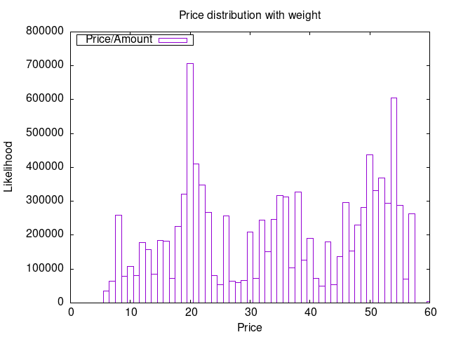
Wow, this is impressive. We see that even though a lot of orders were made within a 20 USD range, most IPs actually cost about 50 USD.
3.6. Batch size distribution
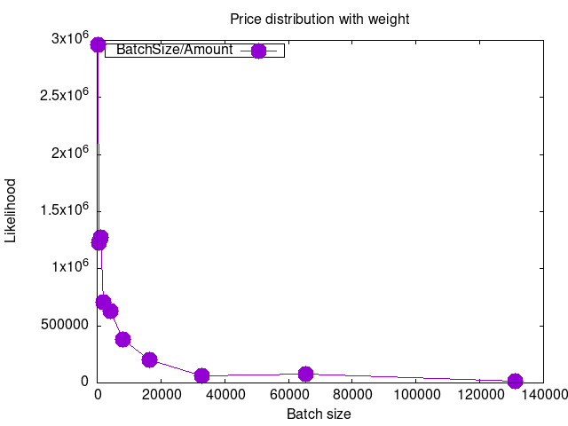
Okay, most batches are small, but the distribution is not monotone.
3.7. How batch size changes with time
Batch size per second definitely makes no sense, but batch size per month probably does. We will use the previously employed trick date recognition and plot IP demand per month.
The IP price is here for reference only, the values are on the right hand side of the plot.
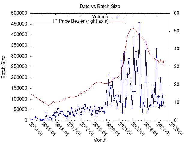
There seems to be a large surge in demand between 2020-2024. The price is multiplied by an aesthetic constant of 5000, and seems to match the growth in demand quite consistently.
3.8. Market Volume by time
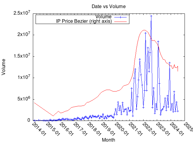
The volume is not that different from batch size really.
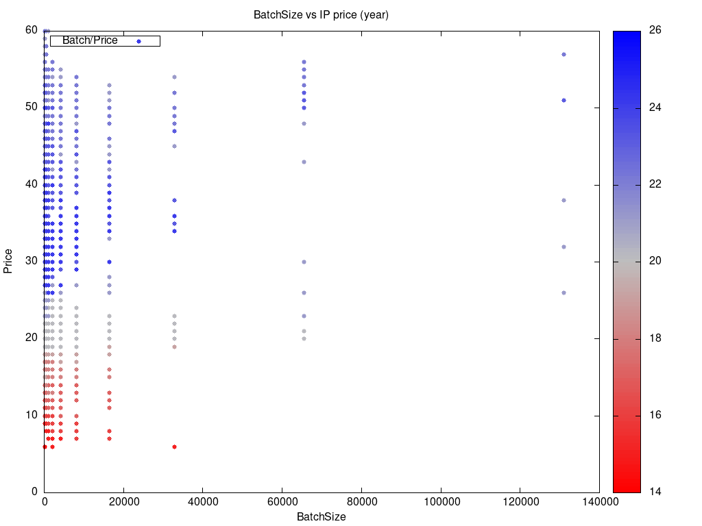
3.9. Let us see how many batches are expensive.
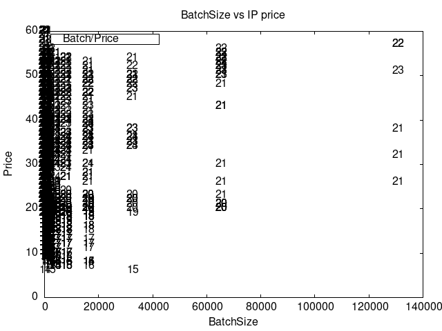
We sort of new this already, but most of the expensive batches are from 2021-2023. The banding in orders, which was visible on previous plots, is very prominent here and is due to IP block sizes being multiples of 2.
Let us do the same thing more beautifully.
3.10. Finding an actual average price per month
Here we need to master some set table and $heredoc.
Let us recall that “average price per month” is “all money” divided by “all IPs”. So we need two series: volume of money, volume of IPs, save into a table.
The dirty trick here is dividing one table by another, which requires querying a heredoc by using the word($0) constuct.
It is crude and slow, but should work now.
Another dirty trick you can see here is how to apply stats to a time series.
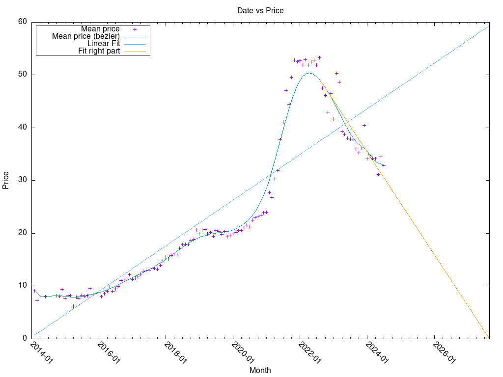
This plot is much more smooth than the “incorrect” average price. I don’t know why.
So, the last part of it, the “fitting” of the right part, is a crutch of titanical proportions, but it clearly lets us see that the price of IPv4 will drop to 0 (because of no demand and total transition to IPv6) by the end of 2026.
3.11. Processed data
3.12. Trade volume